
Fancy-Image-Caption.stack
USER’S MANUAL
BY JOE WORKMAN
F A N C Y I M A G E S T A C K S
for Rapidweaver
http://joeworkman.net • © 2 0 1 0 Aspect Services, LLC • November 15, 2010 • Version 2.0
Table of Contents
Overview! ii
System Requirements! iii
Additional Resources! iii
Caption Stack! 1
Zoom Stack! 1
Magnify Stack! 1
Hover Stack! 1
Popup Stack! 1
Gallery Stack! 1
Preview Stack! 1
Reflection Stack! 1
Reveal Stack! 1
360 Degree Stack! 1
Puzzle Stack! 1
Prints Stack! 1
Version History! 1
i
Overview(概要)
誰でも、ウェブページ上でイメージを望みます!
Fancy Image Stacksで、あなたはエレガントな効果を(それも簡単に)イメージに加えることができます。
There are a dozen image stacks in this set
that give you tons of effects to chose from.
The Fancy Image Stacks utilize JQuery and
work very well in all of our favorite browsers:
私達の好きなすべてブラウザのうちどれでも動作します :
Safari, Firefox, Chrome, Camino, Opera,
and Internet Explorer (お気に入りではなく、必要悪). They even work on your
iPhone!
彼らは、あなたのiPhoneにさえ取り組みます!
This document will go over the following topics for each stack in this set:
この文書はこのセットにおいて個々のスタックについての以下のトピックを入念に調べます:
1. Overview:
このセクションは、スタックがすることを説明します。
2. Basic Setup:
これは、迅速に動かすための基本的なステップ・バイ・ステップのプロセスを与えます。
3. Stack Settings:
このセクションは、利用できるセッティングとそれらを利用する全ての方法のを教えます。
4. CSS Customization:
このセクションは、スタックを正確な好みに合うように調整するために利用できるcssクラスを入念に調べます。
これは、CSSを知っているより高度なユーザーに向いています。
このマニュアルは、あなたにCSSを教えません。 あなたがCSSを学びたいと思うならば、あなたのお気に入りの本屋に行って、本を得てください。 Rapidweaverフォーラムは、初心者補助のための、素晴らしいい大きい資源です。
ii
System Requirements(必要システム構成)
Since the Fancy Image Stacks are plugins, you will need to ensure that you have the following
products installed. In order for us to properly support you, please ensure that
you are running the minimum versions specified.
Apple OS X 10.5+ (Leopard) (http://apple.com/osx)
Realmac Software Rapidweaver 4.2+ (http://www.realmacsoftware.com)
YourHead Stacks Plugin 1.3+ (http://yourhead.com/stacks)
Additional Resources(追加の資源)
このプラグインのライブのデモとサポートのために、以下のサイトを参照してください:
Fancy Image Product Page: http://joeworkman.net/products/fancyimage(他にも色んなプラグインがある)
Fancy Image Test Site: http://fancyimage.joeworkman.net(サイトがない)
Fancy Image Support: http://support.joeworkman.net(何がどこにあるのか不明)
Rapidweaver Forums: http://www.realmacsoftware.com/forums(サイトがおやすみ状態)
YourHead Stacks Plugin Support: http://yourhead.com/stacks/support(スタック本体のサイト)
iii
これから下は有料のプラグインになる。
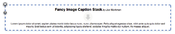
Caption Stack
Overview
The Image Caption Stack is the simplest stack in this
set. There are no fancy effects and no javascript.
Image Caption Stackは、このセットで最も単純なスタックです。 装飾的な影響とjavascriptがありません。
However, the stack does allow you to place a text
caption below your images.
しかし、スタックはイメージの下にテキスト・キャプションを置くことができます。
It gives you are similar effect as an Image Stack with a Text Stack below it.
Text Stackがそれの下にあるImage Stackとしての類似した影響であることを、それは与えます。
Although, since this is all within the same stack, the
text will be much closer to your image, making it
look like a true caption should.
これがすべて同じスタックにあるので、テキストはイメージにずっと近いけれども、それを本当ののキャプションのように見えるようにするべきです。
Basic Setup
1. Image Caption Stackをドラッグしたとき、上記のスタックがページに出現するのを見ます。
2. 下向きの矢印があるスタックのトップセクションにあなたはイメージをドラッグする必要があります。
3. イメージの下のテキストのセクションは、あなたが望ましいキャプションを入れるところです。
4. すぐに、プレビューして、楽しんでください! 残りのセッティングの概要のために、Stack設定セクションを参照してください。
Stack Settings
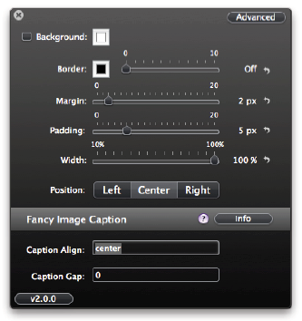
Alignment(調整):
これはスタックに関連してイメージのアラインメント(調整)です(左|センター|右)
Caption Gap(キャプションの隙間):
キャプションとイメージ間のギャップのサイズ。秘訣: それを写真の上で非常に間近にするか均一にするために、負数を使ってください。
!
2
Zoom Stack
Overview
The Image Zoom Stack gives you’re a great effect of zooming the image from a thumbnail
to the full version by simply clicking on the image. This stack utilizes JQuery javascript
framework in order to accomplish this effect. The Zoom Stack was built so you
you can have as many of them on the page as you like.
Basic Setup
1. When you drag your Image Zoom Stack out, you will see the above stack appear on
your page.
2. Simply drag your image onto the image drop area.
3. Set the Image Scale inside the settings HUD to determine the size of your thumbnail.
4. Now preview and enjoy! For an overview of the remaining settings please refer to the
Stack Settings section.
!
1
Stack Settings
Image Scale: The percentage that you would like the
image thumbnail scaled down to compared to the
original.
Speed: The speed in milliseconds of the zoom effect.
CSS Customizing
In this section there will be a review of each of the CSS classes that are used. This section
is not intended to teach you CSS. In order to view the defaults styles for each of the below
elements, please view the source of your stacks page.
.magnify { } This is the class used for the image![]() element.
element.
NOTE: You will probably need to make sure that you use the !important style attribute
to ensure that your custom CSS styles work properly.
!
2
Magnify Stack
Overview
The Image Magnify Stack is an amazing stack that allows you to hover over an image
and have a magnified version of it appear. You can then navigate over the image and
watch the magnified version move along with your mouse. This stack utilizes JQuery
javascript framework in order to accomplish this effect. The Magnify Stack was built so
you you can have as many of them on the page as you like.
!
1
Basic Setup
1. When you drag your Image Zoom Stack out, you will see the above stack appear on
your page.
2. Simply drag your image onto the image drop area.
3. Set the Image Scale inside the settings HUD to determine the size of your thumbnail.
4. Now preview and enjoy! For an overview of the remaining settings please refer to the
Stack Settings section.
!
2
Stack Settings
Title: The title on the magnify box.
Image Scale: The percentage that you would like
the image thumbnail scaled down to compared to
the original.
Zoom Height: The height of the magnified image
box.
Zoom Width: The width of the magnified image
box.
X Offset: Number of pixels to shift horizontally.
Y Offset: Number of pixels to shift horizontally.
Magnify Position: The position that you want the
magnified window to appear. (right | left | top |
bottom)
!
3
CSS Customizing
In this section there will be a review of each of the CSS classes that are used. This section
is not intended to teach you CSS. In order to view the defaults styles for each of the below
elements, please view the source of your stacks page.
#jqzoom-%unique_id% { } This is the id attribute of the tag that is wrapper
around the thumbnail image. You will need to substitute the %unique_id% with the ID
that you set for the stack.
NOTE: You will probably need to make sure that you use the !important style attribute
to ensure that your custom CSS styles work properly.
!
4
Hover Stack
Overview
The Image Hover Stacks are a great set of stacks that add various hover effects to your
images: Fade Out and Slide Out (in 8 directions). When you hover over the image, it
will reveal contents in the background. THe background can contain anything that you
want: text, images or mixed content.
These stacks utilize the JQuery javascript framework in order to accomplish the effects.
The Hover Stacks were built so you you can have as many of them on the page as you
like.
!
1
Basic Setup
1. When you drag your Image Hover Stack out, you will see the above stack appear on
your page.
2. Now you can drag your desired image into the image drop area. This image will
serve as a cover.
3. Drag your desired content into the background content area.
4. Set your desired effect in the settings HUD.
5. Now preview and enjoy! For an overview of the remaining settings please refer to the
Stack Settings section.
!
2
Stack Settings
Effect Type: The desired effect. You can chose from
the following: fadeout, peak, slideright, slideleft,
slideup, slidedown, slidediag-lt, slidediag-lb,
slidediag-rt, slidediag-rb.
Animation Speed: The speed in milliseconds of the
animation effect.
Peak Distance: The height of the peak distance when
the peak effect is used.
!
3
CSS Customizing
In this section there will be a review of each of the CSS classes that are used. This section
is not intended to teach you CSS. In order to view the defaults styles for each of the below
elements, please view the source of your stacks page.
.boxgrid { } This is the class that is used to wrap every Image Hover stack.
.boxcaption { } This is the class assigned to all Popup Caption Boxes.
.boxback { } This is the class assigned to background text area of the Fancy Image Hover
stack.
.%effect_type% { } Every Image Hover stack gets assigned to a class named with its effect
name. You will need to substitute %effect_type% with the actual effect name. This
class exists within the same div as the .boxgrid class. The following effects fall into this
category and are used as classes: fadeout, slideright, slideleft, slideup, slidedown,
slidediag-lt, slidediag-lb, slidediag-rt, slidediag-rb
NOTE: You will probably need to make sure that you use the !important style attribute
to ensure that your custom CSS styles work properly.
!
4
Popup Stack
Overview
The Image Popup Stacks is the easiest way to add popup captions to your images.
When you hover over the image, it will reveal contents of the caption. This stack allows
a portion of the caption to always be shown (image above) as well as the ability to hide
the entire caption.
These stacks utilize the JQuery javascript framework in order to accomplish the effects.
The Hover Stacks were built so you you can have as many of them on the page as you
like.
!
1
Basic Setup
1. When you drag your Image Popup Stack out, you will see the above stack appear on
your page.
2. Now you can drag your desired image into the image drop area.
3. Drag your desired content into the caption content area. You can add text, images or
mixed content.
4. Now preview and enjoy! For an overview of the remaining settings please refer to the
Stack Settings section.
!
2
Stack Settings
Animation Speed: The speed in milliseconds of the
animation effect.
Caption on Top: The Caption will be at the top of the
image.
Caption Background: The color of the caption background.
Caption Height: The total height of the caption. This
is the percentage of the total image height.
Caption Reveal: The height that the caption will be
revealed in its default state. This is the percentage of
the total image height.
Caption Opacity: This is the opacity of the caption
background.
!
3
CSS Customizing
In this section there will be a review of each of the CSS classes that are used. This section
is not intended to teach you CSS. In order to view the defaults styles for each of the below
elements, please view the source of your stacks page.
.boxgrid { } This is the class that is used to wrap every Image Hover stack.
.boxcaption { } This is the class assigned to all Popup Caption Boxes.
.caption { } This is the class assigned to just the Popup Caption Box that don’t completely
hide.
NOTE: You will probably need to make sure that you use the !important style attribute
to ensure that your custom CSS styles work properly.
!
4
Gallery Stack
Overview
The Gallery Stack (formally known as the Fancy Image Lightbox Stack) gives you the
ability to create lightbox galleries with the flexibility of allowing you to place you images
anywhere you want on the page. It provides navigation controls within the lightbox
that make it simple to click through the images in the gallery. This stack set utilizes
JQuery javascript framework in order to accomplish the lightbox effect.
!
1
Basic Setup
1. When you drag your Image Gallery Stack out, you will see the above stack appear on
your page.
2. Simply drag your image onto the image drop area.
3. Set the Image Scale inside the settings HUD to determine the size of your thumbnail.
4. You will need to repeat the above steps for every image that you want to show in
your gallery.
5. Now preview and enjoy! For an overview of the remaining settings please refer to the
Stack Settings section.
!
2
Stack Settings
Gallery Name: ID for each gallery that you want on
your page. All stacks with the same name will
grouped into the same gallery.
Title: The title shown inside the gallery lightbox.
Image Scale: The percentage that you would like the
image thumbnail scaled down to compared to the
original.
Fixed Navigation: Have the navigation tags fixed and
not auto-hide.
Show Thumbnail: When unchecked, the thunbnail
will not appear on the page but the image will still
show in the gallery.
Overlay BG: The color of the background the covers
the webpage behind the lightbox.
Opacity: The level of transparency of the background.
!
3
CSS Customizing
In this section there will be a review of each of the CSS classes that are used. This section
is not intended to teach you CSS. In order to view the defaults styles for each of the below
elements, please view the source of your stacks page.
.lightbox_gallery { } This is the class for the element that launches the lightbox.
#jquery-overlay { } This is the id for lightbox overlay element.
#jquery-lightbox { } This is the id for the lightbox element itself.
#lightbox-loading { } This is the id for the lightbox loading element.
#lightbox-nav { } This is the id for the navigation element.
#lightbox-nav-btnPrev { } This is the id for the Previous button.
#lightbox-nav-btnNext { } This is the id for the Next button.
#lightbox-image { } This is the id for the image that is displayed in the lightbox.
#lightbox-container-image-data-box { } This is the id for the data box below the image.
#lightbox-image-details-caption { } This is the id for the caption section in the data box
#lightbox-secNav-btnClose { } This is the id for the close button.
NOTE: You will probably need to make sure that you use the !important style attribute
to ensure that your custom CSS styles work properly.
!
4
Preview Stack
Overview
The Image Preview Stack show a full scale preview of an image when the mouse hovers
over a thumbnail. The preview window hovers along with the mouse above all content
and can be configured to show in any position relative to the mouse (left, right, above or
below). This stack utilizes JQuery javascript framework in order to accomplish the preview
effect.
!
1
Basic Setup
1. When you drag your Preview Stack out, you will see the above stack appear on your
page.
2. Simply drag your image onto the image drop area.
3. Set the Image Scale inside the settings HUD to determine the size of your thumbnail.
4. Now preview and enjoy! For an overview of the remaining settings please refer to the
Stack Settings section.
!
2
Stack Settings
Title: The title shown inside the lightbox.
Image Scale: The percentage that you would like
the image thumbnail scaled down to compared
to the original.
Center Title: When unchecked, the title in the
preview will be aligned on the right.
Preview Below Mouse: When unchecked, the
preview will show above the mouse cursor.
Preview Right of Mouse: When unchecked, the
preview will show to the left of the mouse cursor.
Preview BG: Background color of the preview
window.
Preview Text: Color of the text within the preview
window.
Border: Color of the preview window border.
Border Size: Size of the preview window border.
!
3
CSS Customizing
In this section there will be a review of each of the CSS classes that are used. This section
is not intended to teach you CSS. In order to view the defaults styles for each of the below
elements, please view the source of your stacks page.
.preview { } This is the class for the element that launches the preview.
#preview { } This is the id for the preview window.
NOTE: You will probably need to make sure that you use the !important style attribute
to ensure that your custom CSS styles work properly.
!
4
Reflection Stack
Overview
The Image Reflection Stack provides an elegant reflection to your images. Drag and
drop and instant reflection. It could not be easier! This stack utilizes JQuery javascript
framework in order to accomplish the reflection effect.
Basic Setup
1. When you drag your Image Lightbox Stack out, you will see the above stack appear
on your page.
2. You can drag your desired image into the image drop area within the stack. Now use
the default stack image settings to resize the image to the desire size for the thumbnail.
(Note: Adding shadow effects to the image will break this stack)
3. Now preview and enjoy! For an overview of the remaining settings please refer to the
Stack Settings section.
!
1
Stack Settings
Height: The height of the reflection.
Padding: The gap between the image and the re-
flection.
Opacity: The transparency of the reflection.
!
2
Reveal Stack
Overview
The Image Reveal Stack gives you show a portion of a larger image and with the click of
a mouse, reveal the full image. This stack set utilizes JQuery javascript framework in
order to accomplish the lightbox effect.
!
1
Basic Setup
1. When you drag your Image Zoom Stack out, you will see the above stack appear on
your page.
2. Now you can drag your desired image into the image drop area.
3. Then you will need to configure the text area with your desired text and replace the
default “Lorem ipsum” text.
4. Now preview and enjoy! For an overview of the remaining settings please refer to
the Stack Settings section.
!
2
Stack Settings
Small Border: The size of the border for the thumbnail.
Big Border: The size of the border when the image is
revealed.
Border: Color of the border.
Caption Height: The height of the caption area.
Small Image Width: The width of the small image.
Small Image Height: The height of the small image
Background: The background color.
Speed: Speed in milliseconds that the image is revealed.
X Offset: The x position of the large image that is
shown when shrunk.
Y Offset: The Y position of the large image that is
shown when shrunk.
Use Button Link: Use a button or text link for the
reveal.
Link Text: Text to be used for the link if no button.
!
3
CSS Customizing
In this section there will be a review of each of the CSS classes that are used. This section
is not intended to teach you CSS. In order to view the defaults styles for each of the below
elements, please view the source of your stacks page.
.photo_slider { } This is the class for the entire revealer element.
.photo_slider_img { } This is the class for the image
.info_area { } This is the class for the data area below the revealed image.
.more_info { } This is the class for the more info area below the small image.
NOTE: You will probably need to make sure that you use the !important style attribute
to ensure that your custom CSS styles work properly.
!
4
360 Degree Stack
Overview
The Image 360 Degree Stack allows you to show off your products with a 360 degree
view. As you hover your mouse over the image, it will rotate around to showcase all
angles of the product. This is accomplished through combining multiple images in a sequence
and rotate through them. This stack utilizes JQuery javascript framework in order
to accomplish this effect. The 360 Degree Stack was built so you you can have as
many of them on the page as you like.
!
1
Basic Setup
1. When you drag your Image Zoom Stack out, you will see the above stack appear on
your page.
2. All of the configuration for this stack is done via the settings HUD. In order to use
your own images, you will need to follow the instructions in the Image Sequence Overview
below. You will need to either upload these images to your server or add them to
your Page Assets. Please refer to the Adding Page Assets FAQ.
3. You will then need to setup the File Path & Prefix and File Extension settings.
4. Now preview and enjoy! For an overview of the remaining settings please refer to the
Stack Settings section.
Image Sequence Overview
You can have from 2 to 100 images in sequence. Of course the more images you have,
the smoother the animation. In order for the stack to properly put the images in sequence
there needs to be a counter in the file name. The format of the file looks like this:
$path/$prefix$counter.$extension -- e.g. index_assets/my_image1.jpg
In the example above the File Path & Prefix setting would be “index_assets/my_image”
In the example above the File Extension setting would be “jpg”
If I had 25 images in this example the number in file name would change from 1-25.
!
2
Stack Settings
File Path & Prefix: This is the path and prefix to
the images files that you will be using for the
360 view. All files must have the same path and
prefix. Please refer to the Basic Setup section
above for more info.
File Extension: This is the file extension of the
images used. All images must have the same
extension.
Speed: The number of full 360 rotations that
will occur over the width of the image.
No. Images: The total number of images used.
Reverse Direction: Rotate the image in the opposite
direction as the mouse.
Click ‘n Drag to Move: For the rotation to occur,
you must click,hold and drag the mouse
across the image.
!
3
Puzzle Stack
Overview
The Image Puzzle Stack is a really fun stack that allows you to turn any image into puzzle
like above. The puzzles are very easy to play, just click on the square you would like
to move. The puzzle also keep track of how many moves you have done and how long
it took you. This stack works great as a marketing tool for you website by letting your
customers have a little fun! This stack utilizes JQuery javascript framework in order to
accomplish the reflection effect.
!
1
Basic Setup
1. When you drag your Image Puzzle Stack out, you will see the above stack appear on
your page.
2. You can drag your desired image into the image drop area within the stack. Now use
the default stack image settings to resize the image or add any other effects that you
like.
3. Now preview and enjoy! For an overview of the remaining settings please refer to the
Stack Settings section.
!
2
Stack Settings
Language: The language code in order to translate the
stack text for your language (en | fr | de | pt).
Success JS: Javascript that will be ran after the puzzle
is successfully solved.
Rows: The number of rows in the puzzle.
Columns: The number of column in the puzzle.
Empty Cell: The cell number that will be empty at
start.
Show Numbers at Start: Show the numbers on the
puzzle pieces at start.
Shuffle at Start: Shuffle the puzzle pieces at start.
Show Shuffle Button: Shuffle Button to restart puzzle.
Show Original Button: Original button shows what
the original image looks like.
Show Numbers Button: Numbers button turns on
and off the numbers on the puzzle pieces.
Show Counter & Timer: The moves and seconds
counters.
!
3
CSS Customizing
In this section there will be a review of each of the CSS classes that are used. This section
is not intended to teach you CSS. In order to view the defaults styles for each of the below
elements, please view the source of jquery.jqpuzzle.css file that is included in the
stack.
#my_puzzle { } This is the id for the div element that contains the puzzle.
.jqPuzzle { } Outermost element which holds the full puzzle interface
.jqp-wrapper { } Wrapper which holds the puzzle pieces and the solution image
.jqp-piece { } A single puzzle piece
.jqp-controls { } The controls area which holds the buttons and the display
.jqp-solved { } Solved state for the display (non-shuffled puzzle)
NOTE: You will probably need to make sure that you use the !important style attribute
to ensure that your custom CSS styles work properly.
!
4
Prints Stack
Overview
The Prints Stack is a beautiful stack that allows you to easily create a gallery of images
that look like photo prints. As you hover over the images, each one will rotate in a random
direction. When the image is clicked, the image will open in a lightbox.
!
1
Basic Setup
1. When you drag your Image Gallery Stack out, you will see the above stack appear on
your page.
2. In the settings HUD, define the quantity of images you would like to display.
3. Simply drag your image onto the image drop area for each print.
4. Set the Image Scale inside the settings HUD to determine the size of your thumbnails.
5. Now preview and enjoy! For an overview of the remaining settings please refer to the
Stack Settings section.
!
2
Stack Settings
Image Quantity: The number of prints you want to
display.
Image Scale: The percentage that you would like the
image thumbnail scaled down to compared to the
original.
Prints Border: The color of the border around each
print.
Shadow: The color of the shadow.
Shadow Hover: The color of the shadow when you
hover over the print.
!
3
Appendix
Important Note on Image Width.
The Stacks Plugin by default has a maximum image width of 800 pixels. Therefore, if
you place an image that is 1000 pixels wide into an image stack, the Stack Plugin will
shrink it down to 800 pixels for you. However, it could be common that you would
want to use an image wider than 800 pixels inside your Fancy Image Stacks. In order to
do this, you can change the maximum image width of Stacks inside the page inspector.
!
1
Version History
Version 2.0 -- 11/16/2010
1. Upgraded stacks to API 2.0
2. Stacks v1.3 is required.
3. New Prints Stack.
4. Renamed Fancy Image Lightbox to Fancy Image Gallery.
5. The Fancy Image Hover stacks have been split into 2 stacks... Hover Stack & Popup
Stack.
6. Auto-update stacks for updates.
7. So many cool changes that I did not keep track.... Sorry!
Version 1.2 -- 3/17/2010
1. Ignore the default css styles in the Image Hover stacks for & .
!
2
Version 1.1
1. Limited release to beta testers only.
Version 1.0 -- 12/10/2009
1. Initial Public Release.
!
3
BY JOE WORKMAN
F A N C Y I M A G E S T A C K S
for Rapidweaver
http://joeworkman.net • © 2 0 1 0 Aspect Services, LLC • November 15, 2010 • Version 2.0
Table of Contents
Overview! ii
System Requirements! iii
Additional Resources! iii
Caption Stack! 1
Zoom Stack! 1
Magnify Stack! 1
Hover Stack! 1
Popup Stack! 1
Gallery Stack! 1
Preview Stack! 1
Reflection Stack! 1
Reveal Stack! 1
360 Degree Stack! 1
Puzzle Stack! 1
Prints Stack! 1
Version History! 1
i
Overview(概要)
誰でも、ウェブページ上でイメージを望みます!
Fancy Image Stacksで、あなたはエレガントな効果を(それも簡単に)イメージに加えることができます。
There are a dozen image stacks in this set
that give you tons of effects to chose from.
The Fancy Image Stacks utilize JQuery and
work very well in all of our favorite browsers:
私達の好きなすべてブラウザのうちどれでも動作します :
Safari, Firefox, Chrome, Camino, Opera,
and Internet Explorer (お気に入りではなく、必要悪). They even work on your
iPhone!
彼らは、あなたのiPhoneにさえ取り組みます!
This document will go over the following topics for each stack in this set:
この文書はこのセットにおいて個々のスタックについての以下のトピックを入念に調べます:
1. Overview:
このセクションは、スタックがすることを説明します。
2. Basic Setup:
これは、迅速に動かすための基本的なステップ・バイ・ステップのプロセスを与えます。
3. Stack Settings:
このセクションは、利用できるセッティングとそれらを利用する全ての方法のを教えます。
4. CSS Customization:
このセクションは、スタックを正確な好みに合うように調整するために利用できるcssクラスを入念に調べます。
これは、CSSを知っているより高度なユーザーに向いています。
このマニュアルは、あなたにCSSを教えません。 あなたがCSSを学びたいと思うならば、あなたのお気に入りの本屋に行って、本を得てください。 Rapidweaverフォーラムは、初心者補助のための、素晴らしいい大きい資源です。
ii
System Requirements(必要システム構成)
Since the Fancy Image Stacks are plugins, you will need to ensure that you have the following
products installed. In order for us to properly support you, please ensure that
you are running the minimum versions specified.
Apple OS X 10.5+ (Leopard) (http://apple.com/osx)
Realmac Software Rapidweaver 4.2+ (http://www.realmacsoftware.com)
YourHead Stacks Plugin 1.3+ (http://yourhead.com/stacks)
Additional Resources(追加の資源)
このプラグインのライブのデモとサポートのために、以下のサイトを参照してください:
Fancy Image Product Page: http://joeworkman.net/products/fancyimage(他にも色んなプラグインがある)
Fancy Image Test Site: http://fancyimage.joeworkman.net(サイトがない)
Fancy Image Support: http://support.joeworkman.net(何がどこにあるのか不明)
Rapidweaver Forums: http://www.realmacsoftware.com/forums(サイトがおやすみ状態)
YourHead Stacks Plugin Support: http://yourhead.com/stacks/support(スタック本体のサイト)
iii
これから下は有料のプラグインになる。
Caption Stack
Overview
The Image Caption Stack is the simplest stack in this
set. There are no fancy effects and no javascript.
Image Caption Stackは、このセットで最も単純なスタックです。 装飾的な影響とjavascriptがありません。
However, the stack does allow you to place a text
caption below your images.
しかし、スタックはイメージの下にテキスト・キャプションを置くことができます。
It gives you are similar effect as an Image Stack with a Text Stack below it.
Text Stackがそれの下にあるImage Stackとしての類似した影響であることを、それは与えます。
Although, since this is all within the same stack, the
text will be much closer to your image, making it
look like a true caption should.
これがすべて同じスタックにあるので、テキストはイメージにずっと近いけれども、それを本当ののキャプションのように見えるようにするべきです。
Basic Setup
1. Image Caption Stackをドラッグしたとき、上記のスタックがページに出現するのを見ます。
2. 下向きの矢印があるスタックのトップセクションにあなたはイメージをドラッグする必要があります。
3. イメージの下のテキストのセクションは、あなたが望ましいキャプションを入れるところです。
4. すぐに、プレビューして、楽しんでください! 残りのセッティングの概要のために、Stack設定セクションを参照してください。
Stack Settings
Alignment(調整):
これはスタックに関連してイメージのアラインメント(調整)です(左|センター|右)
Caption Gap(キャプションの隙間):
キャプションとイメージ間のギャップのサイズ。秘訣: それを写真の上で非常に間近にするか均一にするために、負数を使ってください。
!
2
Zoom Stack
Overview
The Image Zoom Stack gives you’re a great effect of zooming the image from a thumbnail
to the full version by simply clicking on the image. This stack utilizes JQuery javascript
framework in order to accomplish this effect. The Zoom Stack was built so you
you can have as many of them on the page as you like.
Basic Setup
1. When you drag your Image Zoom Stack out, you will see the above stack appear on
your page.
2. Simply drag your image onto the image drop area.
3. Set the Image Scale inside the settings HUD to determine the size of your thumbnail.
4. Now preview and enjoy! For an overview of the remaining settings please refer to the
Stack Settings section.
!
1
Stack Settings
Image Scale: The percentage that you would like the
image thumbnail scaled down to compared to the
original.
Speed: The speed in milliseconds of the zoom effect.
CSS Customizing
In this section there will be a review of each of the CSS classes that are used. This section
is not intended to teach you CSS. In order to view the defaults styles for each of the below
elements, please view the source of your stacks page.
.magnify { } This is the class used for the image
NOTE: You will probably need to make sure that you use the !important style attribute
to ensure that your custom CSS styles work properly.
!
2
Magnify Stack
Overview
The Image Magnify Stack is an amazing stack that allows you to hover over an image
and have a magnified version of it appear. You can then navigate over the image and
watch the magnified version move along with your mouse. This stack utilizes JQuery
javascript framework in order to accomplish this effect. The Magnify Stack was built so
you you can have as many of them on the page as you like.
!
1
Basic Setup
1. When you drag your Image Zoom Stack out, you will see the above stack appear on
your page.
2. Simply drag your image onto the image drop area.
3. Set the Image Scale inside the settings HUD to determine the size of your thumbnail.
4. Now preview and enjoy! For an overview of the remaining settings please refer to the
Stack Settings section.
!
2
Stack Settings
Title: The title on the magnify box.
Image Scale: The percentage that you would like
the image thumbnail scaled down to compared to
the original.
Zoom Height: The height of the magnified image
box.
Zoom Width: The width of the magnified image
box.
X Offset: Number of pixels to shift horizontally.
Y Offset: Number of pixels to shift horizontally.
Magnify Position: The position that you want the
magnified window to appear. (right | left | top |
bottom)
!
3
CSS Customizing
In this section there will be a review of each of the CSS classes that are used. This section
is not intended to teach you CSS. In order to view the defaults styles for each of the below
elements, please view the source of your stacks page.
#jqzoom-%unique_id% { } This is the id attribute of the tag that is wrapper
around the thumbnail image. You will need to substitute the %unique_id% with the ID
that you set for the stack.
NOTE: You will probably need to make sure that you use the !important style attribute
to ensure that your custom CSS styles work properly.
!
4
Hover Stack
Overview
The Image Hover Stacks are a great set of stacks that add various hover effects to your
images: Fade Out and Slide Out (in 8 directions). When you hover over the image, it
will reveal contents in the background. THe background can contain anything that you
want: text, images or mixed content.
These stacks utilize the JQuery javascript framework in order to accomplish the effects.
The Hover Stacks were built so you you can have as many of them on the page as you
like.
!
1
Basic Setup
1. When you drag your Image Hover Stack out, you will see the above stack appear on
your page.
2. Now you can drag your desired image into the image drop area. This image will
serve as a cover.
3. Drag your desired content into the background content area.
4. Set your desired effect in the settings HUD.
5. Now preview and enjoy! For an overview of the remaining settings please refer to the
Stack Settings section.
!
2
Stack Settings
Effect Type: The desired effect. You can chose from
the following: fadeout, peak, slideright, slideleft,
slideup, slidedown, slidediag-lt, slidediag-lb,
slidediag-rt, slidediag-rb.
Animation Speed: The speed in milliseconds of the
animation effect.
Peak Distance: The height of the peak distance when
the peak effect is used.
!
3
CSS Customizing
In this section there will be a review of each of the CSS classes that are used. This section
is not intended to teach you CSS. In order to view the defaults styles for each of the below
elements, please view the source of your stacks page.
.boxgrid { } This is the class that is used to wrap every Image Hover stack.
.boxcaption { } This is the class assigned to all Popup Caption Boxes.
.boxback { } This is the class assigned to background text area of the Fancy Image Hover
stack.
.%effect_type% { } Every Image Hover stack gets assigned to a class named with its effect
name. You will need to substitute %effect_type% with the actual effect name. This
class exists within the same div as the .boxgrid class. The following effects fall into this
category and are used as classes: fadeout, slideright, slideleft, slideup, slidedown,
slidediag-lt, slidediag-lb, slidediag-rt, slidediag-rb
NOTE: You will probably need to make sure that you use the !important style attribute
to ensure that your custom CSS styles work properly.
!
4
Popup Stack
Overview
The Image Popup Stacks is the easiest way to add popup captions to your images.
When you hover over the image, it will reveal contents of the caption. This stack allows
a portion of the caption to always be shown (image above) as well as the ability to hide
the entire caption.
These stacks utilize the JQuery javascript framework in order to accomplish the effects.
The Hover Stacks were built so you you can have as many of them on the page as you
like.
!
1
Basic Setup
1. When you drag your Image Popup Stack out, you will see the above stack appear on
your page.
2. Now you can drag your desired image into the image drop area.
3. Drag your desired content into the caption content area. You can add text, images or
mixed content.
4. Now preview and enjoy! For an overview of the remaining settings please refer to the
Stack Settings section.
!
2
Stack Settings
Animation Speed: The speed in milliseconds of the
animation effect.
Caption on Top: The Caption will be at the top of the
image.
Caption Background: The color of the caption background.
Caption Height: The total height of the caption. This
is the percentage of the total image height.
Caption Reveal: The height that the caption will be
revealed in its default state. This is the percentage of
the total image height.
Caption Opacity: This is the opacity of the caption
background.
!
3
CSS Customizing
In this section there will be a review of each of the CSS classes that are used. This section
is not intended to teach you CSS. In order to view the defaults styles for each of the below
elements, please view the source of your stacks page.
.boxgrid { } This is the class that is used to wrap every Image Hover stack.
.boxcaption { } This is the class assigned to all Popup Caption Boxes.
.caption { } This is the class assigned to just the Popup Caption Box that don’t completely
hide.
NOTE: You will probably need to make sure that you use the !important style attribute
to ensure that your custom CSS styles work properly.
!
4
Gallery Stack
Overview
The Gallery Stack (formally known as the Fancy Image Lightbox Stack) gives you the
ability to create lightbox galleries with the flexibility of allowing you to place you images
anywhere you want on the page. It provides navigation controls within the lightbox
that make it simple to click through the images in the gallery. This stack set utilizes
JQuery javascript framework in order to accomplish the lightbox effect.
!
1
Basic Setup
1. When you drag your Image Gallery Stack out, you will see the above stack appear on
your page.
2. Simply drag your image onto the image drop area.
3. Set the Image Scale inside the settings HUD to determine the size of your thumbnail.
4. You will need to repeat the above steps for every image that you want to show in
your gallery.
5. Now preview and enjoy! For an overview of the remaining settings please refer to the
Stack Settings section.
!
2
Stack Settings
Gallery Name: ID for each gallery that you want on
your page. All stacks with the same name will
grouped into the same gallery.
Title: The title shown inside the gallery lightbox.
Image Scale: The percentage that you would like the
image thumbnail scaled down to compared to the
original.
Fixed Navigation: Have the navigation tags fixed and
not auto-hide.
Show Thumbnail: When unchecked, the thunbnail
will not appear on the page but the image will still
show in the gallery.
Overlay BG: The color of the background the covers
the webpage behind the lightbox.
Opacity: The level of transparency of the background.
!
3
CSS Customizing
In this section there will be a review of each of the CSS classes that are used. This section
is not intended to teach you CSS. In order to view the defaults styles for each of the below
elements, please view the source of your stacks page.
.lightbox_gallery { } This is the class for the element that launches the lightbox.
#jquery-overlay { } This is the id for lightbox overlay element.
#jquery-lightbox { } This is the id for the lightbox element itself.
#lightbox-loading { } This is the id for the lightbox loading element.
#lightbox-nav { } This is the id for the navigation element.
#lightbox-nav-btnPrev { } This is the id for the Previous button.
#lightbox-nav-btnNext { } This is the id for the Next button.
#lightbox-image { } This is the id for the image that is displayed in the lightbox.
#lightbox-container-image-data-box { } This is the id for the data box below the image.
#lightbox-image-details-caption { } This is the id for the caption section in the data box
#lightbox-secNav-btnClose { } This is the id for the close button.
NOTE: You will probably need to make sure that you use the !important style attribute
to ensure that your custom CSS styles work properly.
!
4
Preview Stack
Overview
The Image Preview Stack show a full scale preview of an image when the mouse hovers
over a thumbnail. The preview window hovers along with the mouse above all content
and can be configured to show in any position relative to the mouse (left, right, above or
below). This stack utilizes JQuery javascript framework in order to accomplish the preview
effect.
!
1
Basic Setup
1. When you drag your Preview Stack out, you will see the above stack appear on your
page.
2. Simply drag your image onto the image drop area.
3. Set the Image Scale inside the settings HUD to determine the size of your thumbnail.
4. Now preview and enjoy! For an overview of the remaining settings please refer to the
Stack Settings section.
!
2
Stack Settings
Title: The title shown inside the lightbox.
Image Scale: The percentage that you would like
the image thumbnail scaled down to compared
to the original.
Center Title: When unchecked, the title in the
preview will be aligned on the right.
Preview Below Mouse: When unchecked, the
preview will show above the mouse cursor.
Preview Right of Mouse: When unchecked, the
preview will show to the left of the mouse cursor.
Preview BG: Background color of the preview
window.
Preview Text: Color of the text within the preview
window.
Border: Color of the preview window border.
Border Size: Size of the preview window border.
!
3
CSS Customizing
In this section there will be a review of each of the CSS classes that are used. This section
is not intended to teach you CSS. In order to view the defaults styles for each of the below
elements, please view the source of your stacks page.
.preview { } This is the class for the element that launches the preview.
#preview { } This is the id for the preview window.
NOTE: You will probably need to make sure that you use the !important style attribute
to ensure that your custom CSS styles work properly.
!
4
Reflection Stack
Overview
The Image Reflection Stack provides an elegant reflection to your images. Drag and
drop and instant reflection. It could not be easier! This stack utilizes JQuery javascript
framework in order to accomplish the reflection effect.
Basic Setup
1. When you drag your Image Lightbox Stack out, you will see the above stack appear
on your page.
2. You can drag your desired image into the image drop area within the stack. Now use
the default stack image settings to resize the image to the desire size for the thumbnail.
(Note: Adding shadow effects to the image will break this stack)
3. Now preview and enjoy! For an overview of the remaining settings please refer to the
Stack Settings section.
!
1
Stack Settings
Height: The height of the reflection.
Padding: The gap between the image and the re-
flection.
Opacity: The transparency of the reflection.
!
2
Reveal Stack
Overview
The Image Reveal Stack gives you show a portion of a larger image and with the click of
a mouse, reveal the full image. This stack set utilizes JQuery javascript framework in
order to accomplish the lightbox effect.
!
1
Basic Setup
1. When you drag your Image Zoom Stack out, you will see the above stack appear on
your page.
2. Now you can drag your desired image into the image drop area.
3. Then you will need to configure the text area with your desired text and replace the
default “Lorem ipsum” text.
4. Now preview and enjoy! For an overview of the remaining settings please refer to
the Stack Settings section.
!
2
Stack Settings
Small Border: The size of the border for the thumbnail.
Big Border: The size of the border when the image is
revealed.
Border: Color of the border.
Caption Height: The height of the caption area.
Small Image Width: The width of the small image.
Small Image Height: The height of the small image
Background: The background color.
Speed: Speed in milliseconds that the image is revealed.
X Offset: The x position of the large image that is
shown when shrunk.
Y Offset: The Y position of the large image that is
shown when shrunk.
Use Button Link: Use a button or text link for the
reveal.
Link Text: Text to be used for the link if no button.
!
3
CSS Customizing
In this section there will be a review of each of the CSS classes that are used. This section
is not intended to teach you CSS. In order to view the defaults styles for each of the below
elements, please view the source of your stacks page.
.photo_slider { } This is the class for the entire revealer element.
.photo_slider_img { } This is the class for the image
.info_area { } This is the class for the data area below the revealed image.
.more_info { } This is the class for the more info area below the small image.
NOTE: You will probably need to make sure that you use the !important style attribute
to ensure that your custom CSS styles work properly.
!
4
360 Degree Stack
Overview
The Image 360 Degree Stack allows you to show off your products with a 360 degree
view. As you hover your mouse over the image, it will rotate around to showcase all
angles of the product. This is accomplished through combining multiple images in a sequence
and rotate through them. This stack utilizes JQuery javascript framework in order
to accomplish this effect. The 360 Degree Stack was built so you you can have as
many of them on the page as you like.
!
1
Basic Setup
1. When you drag your Image Zoom Stack out, you will see the above stack appear on
your page.
2. All of the configuration for this stack is done via the settings HUD. In order to use
your own images, you will need to follow the instructions in the Image Sequence Overview
below. You will need to either upload these images to your server or add them to
your Page Assets. Please refer to the Adding Page Assets FAQ.
3. You will then need to setup the File Path & Prefix and File Extension settings.
4. Now preview and enjoy! For an overview of the remaining settings please refer to the
Stack Settings section.
Image Sequence Overview
You can have from 2 to 100 images in sequence. Of course the more images you have,
the smoother the animation. In order for the stack to properly put the images in sequence
there needs to be a counter in the file name. The format of the file looks like this:
$path/$prefix$counter.$extension -- e.g. index_assets/my_image1.jpg
In the example above the File Path & Prefix setting would be “index_assets/my_image”
In the example above the File Extension setting would be “jpg”
If I had 25 images in this example the number in file name would change from 1-25.
!
2
Stack Settings
File Path & Prefix: This is the path and prefix to
the images files that you will be using for the
360 view. All files must have the same path and
prefix. Please refer to the Basic Setup section
above for more info.
File Extension: This is the file extension of the
images used. All images must have the same
extension.
Speed: The number of full 360 rotations that
will occur over the width of the image.
No. Images: The total number of images used.
Reverse Direction: Rotate the image in the opposite
direction as the mouse.
Click ‘n Drag to Move: For the rotation to occur,
you must click,hold and drag the mouse
across the image.
!
3
Puzzle Stack
Overview
The Image Puzzle Stack is a really fun stack that allows you to turn any image into puzzle
like above. The puzzles are very easy to play, just click on the square you would like
to move. The puzzle also keep track of how many moves you have done and how long
it took you. This stack works great as a marketing tool for you website by letting your
customers have a little fun! This stack utilizes JQuery javascript framework in order to
accomplish the reflection effect.
!
1
Basic Setup
1. When you drag your Image Puzzle Stack out, you will see the above stack appear on
your page.
2. You can drag your desired image into the image drop area within the stack. Now use
the default stack image settings to resize the image or add any other effects that you
like.
3. Now preview and enjoy! For an overview of the remaining settings please refer to the
Stack Settings section.
!
2
Stack Settings
Language: The language code in order to translate the
stack text for your language (en | fr | de | pt).
Success JS: Javascript that will be ran after the puzzle
is successfully solved.
Rows: The number of rows in the puzzle.
Columns: The number of column in the puzzle.
Empty Cell: The cell number that will be empty at
start.
Show Numbers at Start: Show the numbers on the
puzzle pieces at start.
Shuffle at Start: Shuffle the puzzle pieces at start.
Show Shuffle Button: Shuffle Button to restart puzzle.
Show Original Button: Original button shows what
the original image looks like.
Show Numbers Button: Numbers button turns on
and off the numbers on the puzzle pieces.
Show Counter & Timer: The moves and seconds
counters.
!
3
CSS Customizing
In this section there will be a review of each of the CSS classes that are used. This section
is not intended to teach you CSS. In order to view the defaults styles for each of the below
elements, please view the source of jquery.jqpuzzle.css file that is included in the
stack.
#my_puzzle { } This is the id for the div element that contains the puzzle.
.jqPuzzle { } Outermost element which holds the full puzzle interface
.jqp-wrapper { } Wrapper which holds the puzzle pieces and the solution image
.jqp-piece { } A single puzzle piece
.jqp-controls { } The controls area which holds the buttons and the display
.jqp-solved { } Solved state for the display (non-shuffled puzzle)
NOTE: You will probably need to make sure that you use the !important style attribute
to ensure that your custom CSS styles work properly.
!
4
Prints Stack
Overview
The Prints Stack is a beautiful stack that allows you to easily create a gallery of images
that look like photo prints. As you hover over the images, each one will rotate in a random
direction. When the image is clicked, the image will open in a lightbox.
!
1
Basic Setup
1. When you drag your Image Gallery Stack out, you will see the above stack appear on
your page.
2. In the settings HUD, define the quantity of images you would like to display.
3. Simply drag your image onto the image drop area for each print.
4. Set the Image Scale inside the settings HUD to determine the size of your thumbnails.
5. Now preview and enjoy! For an overview of the remaining settings please refer to the
Stack Settings section.
!
2
Stack Settings
Image Quantity: The number of prints you want to
display.
Image Scale: The percentage that you would like the
image thumbnail scaled down to compared to the
original.
Prints Border: The color of the border around each
print.
Shadow: The color of the shadow.
Shadow Hover: The color of the shadow when you
hover over the print.
!
3
Appendix
Important Note on Image Width.
The Stacks Plugin by default has a maximum image width of 800 pixels. Therefore, if
you place an image that is 1000 pixels wide into an image stack, the Stack Plugin will
shrink it down to 800 pixels for you. However, it could be common that you would
want to use an image wider than 800 pixels inside your Fancy Image Stacks. In order to
do this, you can change the maximum image width of Stacks inside the page inspector.
!
1
Version History
Version 2.0 -- 11/16/2010
1. Upgraded stacks to API 2.0
2. Stacks v1.3 is required.
3. New Prints Stack.
4. Renamed Fancy Image Lightbox to Fancy Image Gallery.
5. The Fancy Image Hover stacks have been split into 2 stacks... Hover Stack & Popup
Stack.
6. Auto-update stacks for updates.
7. So many cool changes that I did not keep track.... Sorry!
Version 1.2 -- 3/17/2010
1. Ignore the default css styles in the Image Hover stacks for
,
& .
2. Customize the alignment of the caption in the Image Caption Stack.
3. Fixed issue where only English was being used for Puzzle Stack.
4. Added Spanish (sp) support for the Puzzle stack.
5. Ability to add custom Javascript code to run after Puzzle stack is completed. This
could do anything. Redirect to page, send alert to screen, etc.
6. Resolved a lot of conflicts between all stacks and other themes and stacks. For example,
my Lightbox Stack can now be used on the same page with the Hover Stacks.
7. Ability for Hover popup to drop down from top as well as popup from bottom.
8. You can now adjust the transparency of the caption in Hover Popup stacks.
9. You can not have multiple Lightbox galleries per page.
10. You can now launch an entire Lightbox Gallery from a single thumbnail.
11. Issues with PlusKit @import resolved.
12. Added the ability to set the alignment of all Fancy Image Stacks.
13. Upgraded all stacks to use JQuery v1.4.2
14. All stacks not dynamically determine is jQuery is already loaded.
15. Fixed the fadeout effect with the Hover Image stack.
16. Replaced stock images with my own photography.
17. Preview Stack - the X & Y coordinate settings needed to be swapped.
!2
Version 1.1
1. Limited release to beta testers only.
Version 1.0 -- 12/10/2009
1. Initial Public Release.
!
3