

数値を使ってのブロックを作成。
ブロック名:my-number-brock
HTMLのみのシンプルな囲み枠を作成してみる
HTMLでは以下のようになり、これをブロックに反映させることにする。
しかし、ここでは囲み枠の「太さ」と「スタイル」「カラー」を変えることしかまだできていない。
<p style="border: #ffb6c1 solid 1px;"> ここに本文を入れます。 </p>数値で設定するということになるので、とりあえず枠の線の太さを数値で変化させるようにしてみる。
CSSを外部リンクで適用できない場合などに使用される style タグ。これを使用する。
pタグなどのhtml要素に対して、style=” “(style属性)を追加して、直接スタイルを指定する。
「CSS 枠線の幅」とかで検索すると「border-width」とか出てくる。このブロックではこれを直接使用しないで「borderWidth」と表現する。最初は小文字、2番目を大文字で「-」は外す。
するとこれが実際に出力される時に「border-width」となる。
実際の出力コード:<p style = “border-width:1px; “>
edit.js や save.js のプレビューを確認するための style.scss に以下を記述して完成形を作成して確認しておくと理解しやすい。確認が済んだら削除しておくこと。
.wp-block-create-block-my-number-block {
	background-color: #21759b;
	border-width: 1px dotted #f00;
	border-style: dotted;
	color: #fff;
	padding: 20px;
	margin: 20px;
}
@wordpress/create-blockのインストール
CDでpluginsフォルダへ移動
cd /Users/polo/Local\ Sites/local-malon/app/public/wp-content/plugins
pluginsファオルだへ移動できたらインストールする。
npx @wordpress/create-block my-first-block
これでもひな型を作成できる。
npx create-guten-block my-first-block
これでも良い。latestとは「最新」という意味。
npx @wordpress/create-block@latest my-first-block
ターミナルで「Code is Poetry」となったら完了。
インストールが完了したら、ブロックを必ず有効化する。
以下のコマンドで開発モード実行のスタートになる。
npm start
最後に使うことになるが、本番用のコードを作成するには、以下のコマンドを実行することになる。
npm run build
以上。
実際にブロックを作成してみる
まず最初にやることは数値のコントロールをするために「components」フォルダを作成して、その中に「number-control.js」ファイルを作成する。
このファイルによって、数値を細かく設定できるようになる。
import { BaseControl } from "@wordpress/components";

  const NumberControl = (props) => {
    const { min, max, step, value, onChange, label, ...additionalProps } = props;
    const minlength = min.toString().length;

    return (
      <BaseControl label={label}>
        <input
          type="number"
          min={min}
          max={max}
          step={step}
          value={value}
          onChange={(e) => {
            let val = e.target.value;
            if (e.target.value.length >= minlength) {
              val = val > max ? max : val;
              val = val < min ? min : val;
            }
            onChange(val);
          }}
          onBlur={(e) => {
            let val = e.target.value;
            if (e.target.value.length < minlength) {
              val = min;
            }
            onChange(val);
          }}
          style={{ marginLeft: "8px" }}
        />
      </BaseControl>
    );
  };

  export default NumberControl;
① block.json の attributes に追加する。
“borderWidth” オブジェクトをまず定義(宣言)する。type は数値を扱うので integer、default は初期設定の数値。
"attributes": {
	  "borderWidth": {
		"type": "integer",
		"default": 1
	  }
	},
② edit.js で RangeControl(範囲コントロール)を追加。
import { RangeControl } from "@wordpress/components";数値が変わった時、更新するイベントハンドラーを export default function Edit 内に追加。
const onChangeColumnCount = (val) => {
    setAttributes({ borderWidth: val });
  };
block.json の完成ファイル
“attributes”の”border”は線の種類なので”string”、”borderWidth”は枠囲みの線の太さなので”integer”
{
	"$schema": "https://schemas.wp.org/trunk/block.json",
	"apiVersion": 3,
	"name": "create-block/my-number-block",
	"version": "0.1.0",
	"title": "My Number Block",
	"category": "widgets",
	"icon": "smiley",
	"description": "数値コントロールのブロック例",
	"example": {},
	"supports": {
		"html": true,
		"color": {
			"gradients": true
		},
		"spacing": {
			"margin": true,
			"padding": true,
			"blockGap": true
		}
	},
	"attributes": {
		"content": {
			"type": "string",
			"source": "html",
			"selector": "p"
		},
		"border": {
			"type": "string",
			"default": "solid"
		},
		"borderWidth": {
			"type": "integer",
			"default": 1
		},
		"style": {
			"type": "object",
			"default": {
				"color": {
					"text": "#3a3a3a",
					"background": "#f3faf1"
				}
			}
		}
	},
	"textdomain": "multi-columns",
	"editorScript": "file:./index.js",
	"editorStyle": "file:./index.css",
	"style": "file:./style-index.css",
	"viewScript": "file:./view.js"
}
edit.js の完成ファイル
import { __ } from "@wordpress/i18n";
import { useBlockProps, RichText, InspectorControls, } from "@wordpress/block-editor";
// SelectControl を追加でインポート
import { PanelBody, SelectControl } from "@wordpress/components";
import NumberControl from "./components/number-control";
import "./editor.scss";
//------------------- パーツの作成と全体のレイアウト設定 ------------------------------------------------
export default function Edit({ attributes, setAttributes }) {
// attributes から columnRuleStyle を分割代入して取得
const { border, borderWidth } = attributes;
// columnRuleStyle をスタイルのオブジェクト columnStyles に追加
const columnStyles = { border, borderWidth };
const onChangeContent = (val) => {
setAttributes({ content: val });//コンテンツのテキストが変更された時に入れる内容
};
const onChangeBborderWidth = (val) => {
setAttributes({ borderWidth: Number(val) });//外回り枠の太さ
};
const onChangeBorder = (val) => {
setAttributes({ border: val });//区切り線のスタイル
};
// 新たに PanelBody を追加してその中に SelectControl コンポーネントを追加
return (
<>
<InspectorControls>
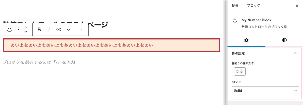
<PanelBody title="枠の設定">
<NumberControl
label="枠回りの線の太さ"
onChange={onChangeBborderWidth}
value={borderWidth}
min={1}
max={8}
/>
<SelectControl
label="Style"
onChange={onChangeBorder}
value={border}
options={[
{
label: "None",
value: "none",
},
{
label: "Solid",
value: "solid",
},
{
label: "Dotted",
value: "dotted",
},
{
label: "Dashed",
value: "dashed",
},
{
label: "Double",
value: "double",
},
{
label: "Groove",
value: "groove",
},
{
label: "Ridge",
value: "ridge",
},
]}
/>
</PanelBody>
</InspectorControls>
<RichText
{...useBlockProps({ style: columnStyles })}
tagName="p"
onChange={onChangeContent}//テキストを変更したときの動作
value={attributes.content}//テキストを変更した時入れる内容
placeholder="テキストを入力してください ..."
/>
</>
);
}save.js の完成ファイル
import { useBlockProps, RichText } from "@wordpress/block-editor";

export default function save({ attributes }) {
  // attributes から columnRuleStyle を分割代入で取得
  const { border, borderWidth } = attributes;
  // スタイルを表すオブジェクトに columnRuleStyle を追加
  const columnStyles = { border, borderWidth };

  return (
    <RichText.Content
      {...useBlockProps.save({ style: columnStyles })}
      tagName="p"
      value={attributes.content}//editで変更されたテキストの内容を表示する
    />
  );
}
.wp-block-create-block-my-number-block {
}上と同じ。
.wp-block-create-block-my-number-block {

}