

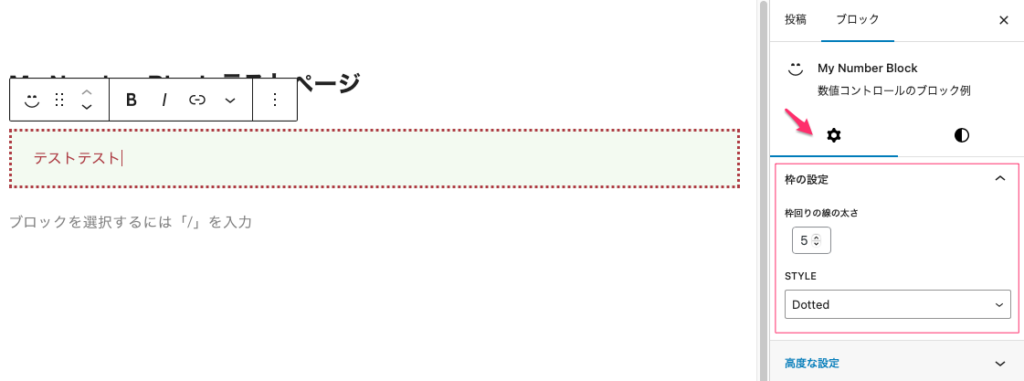
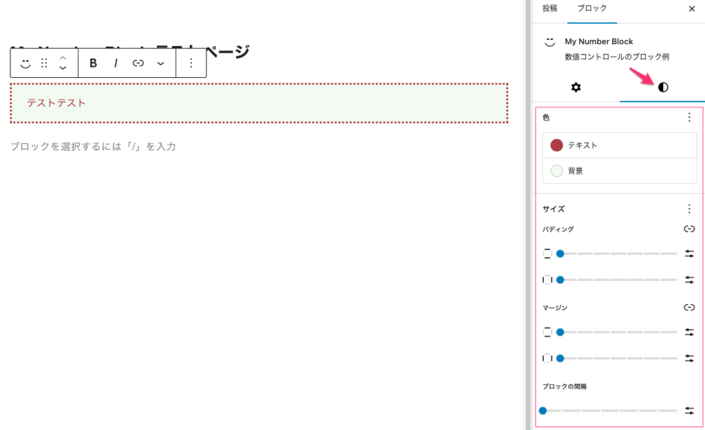
create-blockで作成したひな型を使って枠のブロックとその枠のスタイルを作成。
数値で枠線の太さを変え、スタイルで線を実線や点線、二重線と変更する。色も変えることができる。但し、色は枠とテキストは同じ色で背景の色は別の色で設定できる。
{
	"$schema": "https://schemas.wp.org/trunk/block.json",
	"apiVersion": 3,
	"name": "create-block/my-number-block",
	"version": "0.1.0",
	"title": "My Number Block",
	"category": "widgets",
	"icon": "smiley",
	"description": "数値コントロールのブロック例",
	"example": {},
	"supports": {
		"html": true,
		"color": {
			"gradients": true
		},
		"spacing": {
			"margin": true,
			"padding": true,
			"blockGap": true
		}
	},
	"attributes": {
		"content": {
			"type": "string",
			"source": "html",
			"selector": "p"
		},
		"border": {
			"type": "string",
			"default": "solid"
		},
		"borderWidth": {
			"type": "integer",
			"default": 1
		},
		"style": {
			"type": "object",
			"default": {
				"color": {
					"text": "#3a3a3a",
					"background": "#f3faf1"
				}
			}
		}
	},

	"textdomain": "multi-columns",
	"editorScript": "file:./index.js",
	"editorStyle": "file:./index.css",
	"style": "file:./style-index.css",
	"viewScript": "file:./view.js"
}
import { __ } from "@wordpress/i18n";
import { useBlockProps, RichText, InspectorControls, } from "@wordpress/block-editor";
import { PanelBody, SelectControl } from "@wordpress/components";
import NumberControl from "./components/number-control";
import "./editor.scss";
//------------------- パーツの作成と全体のレイアウト設定 ------------------------------------------------
export default function Edit({ attributes, setAttributes }) {
const { border, borderWidth } = attributes;// attributes から columnRuleStyle を分割代入して取得
const columnStyles = { border, borderWidth };// columnRuleStyle をスタイルのオブジェクト columnStyles に追加
const onChangeContent = (val) => {
setAttributes({ content: val });//コンテンツのテキストが変更された時に入れる内容
};
const onChangeBborderWidth = (val) => {
setAttributes({ borderWidth: Number(val) });//外回り枠の太さ
};
const onChangeBorder = (val) => {
setAttributes({ border: val });//区切り線のスタイル
};
// 新たに PanelBody を追加してその中に SelectControl コンポーネントを追加
return (
<>
<InspectorControls>
<PanelBody title="枠の設定">
<NumberControl
label="枠回りの線の太さ"
onChange={onChangeBborderWidth}
value={borderWidth}
min={1}
max={8}
/>
<SelectControl
label="スタイル"
onChange={onChangeBorder}
value={border}
options={[
{ label: "None", value: "none" },
{ label: "Solid", value: "solid" },
{ label: "Dotted", value: "dotted" },
{ label: "Dashed", value: "dashed" },
{ label: "Double", value: "double" },
{ label: "Groove", value: "groove" },
{ label: "Ridge", value: "ridge" },
]}
/>
</PanelBody>
</InspectorControls>
<RichText
{...useBlockProps({ style: columnStyles })}
tagName="p"
onChange={onChangeContent}//テキスト内容を変更したときの動作
value={attributes.content}//テキスト内容を変更した時入れる値
placeholder="テキストを入力してください ..."
/>
</>
);
}import { useBlockProps, RichText } from "@wordpress/block-editor";
export default function save({ attributes }) {
const { border, borderWidth } = attributes;// attributes から columnRuleStyle を分割代入で取得
const columnStyles = { border, borderWidth };// スタイルを表すオブジェクトに columnRuleStyle を追加
return (
<RichText.Content
{...useBlockProps.save({ style: columnStyles })}
tagName="p"
value={attributes.content}//editで変更されたテキストの内容を表示する
/>
);
}