
ブロック名:Local-Polo/two-colr-settings
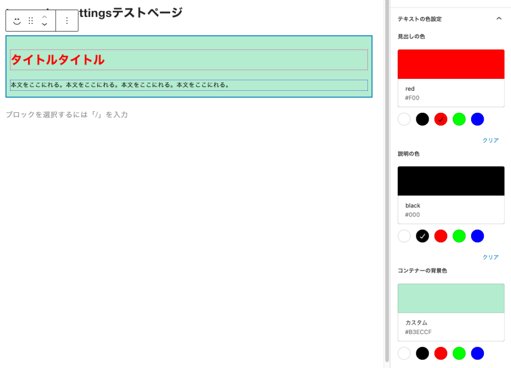
普通ブロックを作成するとき、テキストに色を設定すると、どのテキストも同じ色で設定される。
これを別々のテキストとして色を変えることができないか?ということ。
以下はタイトルとテキストの2つの要素があるブロックになる。そのうち2つのテキストを別々に色を変えることができる。
成功したblock.json
{
	"$schema": "https://schemas.wp.org/trunk/block.json",
	"apiVersion": 3,
	"name": "create-block/two-color-settings",
	"version": "0.1.0",
	"title": "Two Color Settings",
	"category": "widgets",
	"icon": "smiley",
	"description": "2種類のテキストの色を別々に設定する",
	"example": {},
	"supports": {
		"html": false
	},
	"attributes": {
		"heading": {
			"type":"string"
		},
		"description": {
			"type": "string"
		},
		"headingColor": {
			"type": "string"
		},
		"descriptionColor": {
			"type": "string"
		},
		"containerBg": {
			"type": "string"
		}
	},
	"textdomain": "two-color-settings",
	"editorScript": "file:./index.js",
	"editorStyle": "file:./index.css",
	"style": "file:./style-index.css",
	"viewScript": "file:./view.js"
}成功したedit.js
import { __ } from '@wordpress/i18n';
import {
	BlockControls,
	MediaPlaceholder,
	RichText,
	useBlockProps,
	MediaUpload,
	InspectorControls
} from '@wordpress/block-editor';
import {
	PanelBody,
	ToolbarButton,
	ToolbarGroup,
	ColorPalette,
	__experimentalHeading as Heading
} from '@wordpress/components';

import './editor.scss';

const COLORS = [
	{ name: 'white', color: '#fff' },
	{ name: 'black', color: '#000' },
	{ name: 'red', color: '#f00' },
	{ name: 'green', color: '#0f0' },
	{ name: 'blue', color: '#00f' },
];

export default function Edit(props) {
	const { attributes, setAttributes } = props;
	const { heading, description, image, headingColor, descriptionColor, containerBg } = attributes;

	return (
		<>
			{
				image && image?.url && (
					<BlockControls>
						<ToolbarGroup>
							<MediaUpload
								onSelect={(v) =>
									setAttributes({
										image: {
											url: v.url,
											alt: v.alt,
											id: v.id,
										},
									})
								}
								allowedTypes={['image']}
								value={image?.id}
								render={({ open }) => (
									<ToolbarButton title="Edit Image" icon="edit" onClick={open} />
								)}
							/>
						</ToolbarGroup>
					</BlockControls>
				)}
			<InspectorControls>
				<PanelBody title="Card Styles" initialOpen={true}>
					<Heading> Heading Color</Heading>
					<ColorPalette
						colors={COLORS}
						value={headingColor}
						onChange={(v) =>
							setAttributes({
								headingColor: v,
							})
						}
					/>
					<Heading> Description Color</Heading>
					<ColorPalette
						colors={COLORS}
						value={descriptionColor}
						onChange={(v) =>
							setAttributes({
								descriptionColor: v,
							})
						}
					/>
					<Heading> Container BackgroundColor</Heading>
					<ColorPalette
						colors={COLORS}
						value={containerBg}
						onChange={(v) =>
							setAttributes({
								containerBg: v,
							})
						}
					/>
				</PanelBody>
			</InspectorControls>

			<div
				{...useBlockProps()}
				style={{
					backgroundColor: containerBg
				}}
			>
				{image && image?.url ? (
					<img src={image.url} alt={image.alt} />
				) : (
					<MediaPlaceholder
						onSelect={(v) => {
							setAttributes({
								image: {
									url: v.url,
									alt: v.alt,
									id: v.id,
								},
							});
						}}
						allowedTypes={["image"]}
						multiple={false}
						labels={{ title: "Upload Card Image" }}
					/>
				)}

				<RichText
					tagName="h2"
					className="heading"
					value={heading}
					onChange={(v) =>
						setAttributes({
							heading: v,
						})
					}
					placeholder="write heading..."
					style={{ color: headingColor }}
				/>
				<RichText
					tagName="p"
					className="description"
					value={description}
					onChange={(v) =>
						setAttributes({
							description: v,
						})
					}
					placeholder="write description..."
					style={{ color: descriptionColor }}
				/>
			</div>
		</>
	);
}成功したsave.js
import { RichText, useBlockProps } from '@wordpress/block-editor';

export default function save(props) {
	const { attributes } = props;
	const { heading, description, image, headingColor, descriptionColor, containerBg } = attributes;
	return (
		<div
			{...useBlockProps.save()}
			style={{
				backgroundColor: containerBg,
			}}
		>
			{image && image?.url && <img src={image.url} alt={image.alt} />}

			{heading && (
				<RichText.Content tagName="h2" className="heading" value={heading}
					style={{ color: headingColor }}
				/>
			)}
			{description && (
				<RichText.Content
					tagName="p"
					className="description"
					value={description}
					style={{ color: descriptionColor }}
				/>
			)}

		</div>
	);
}
h2.heading {
border: 1px dotted rgb(255, 0, 136);
padding: 0px;
}
p.description {
border: 1px dotted rgb(43, 0, 255);
padding: 0px;
}
h2.heading {
	border: 1px dotted rgb(255, 0, 136);
	padding: 0px;
}
p.description {
	border: 1px dotted rgb(43, 0, 255);
	padding: 0px;
	margin-top: -10px;
}