
こんな感じの枠を作成。
ブロック名:frame-block
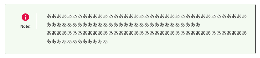
ここまでの完成形ファイル。できれば左のアイコンとテキストを天地中心に入れたいがうまくいかない。その他はなんとかなった。
ここでの設定で左のアイコンの下、Note!をRitchテキストで濃ゆく表示する方法で作成している。
それと共にRitchテキストを複数設置したのでそのやり方もやっている。同じ条件でRitchテキストを2つ以上設定すると必ず問題が起こるはずである。
後はフォントサイズ、テキストと線の色、背景色、線のスタイルを設定できるようになっている。
WordPressのダッシュアイコンを使ったアイコンの表示
アイコン(dashicons)の取得先:https://developer.wordpress.org/resource/dashicons/
以下が全てうまく行ったファイルになる。
26と32行目がポイントでRitchテキストを複数使う場合、どのRitchテキストが対象になっているかを示さなければない。
一般的にRitchテキストの説明が1つだけの場合が多いのであんまり問題にならないが、2つ以上になるとどのRitchテキストなのか分からないと混乱していまい、どれも同じように出力されてしまうという現象になるはずである。
“selector”: “p.polo-caption”これはp タグの中のcaptionクラス名を指定している。これで同じpタグだと区別がつかないが、クラス名をつけることで区別されるようになる。
{
	"$schema": "https://schemas.wp.org/trunk/block.json",
	"apiVersion": 3,
	"name": "create-block/frame-block",
	"version": "0.1.0",
	"title": "枠囲み",
	"category": "widgets",
	"icon": "smiley",
	"description": "囲み枠で左にアイコン、右に段落を設定",
	"example": {},
	"supports": {
		"html": true,
		"color": {
			"gradients": true
		},
		"spacing": {
			"margin": true,
			"padding": true,
			"blockGap": true
		}
	},
	"attributes": {
		"contentLeft": {
			"type": "string",
			"source": "text",
			"selector": "p.polo-caption",
			"default": "注意!"
		},
		"contentRight": {
			"type": "string",
			"source": "text",
			"selector": "p.contentRight",
			"default": "テキストを入力してください ..."
		},
		"title": {
            "type": "string",
            "selector": "span",
            "default": ""
        },
		"border": {
			"type": "string",
			"default": "solid"
		},
		"borderWidth": {
			"type": "integer",
			"default": 1
		},
		"fontSize": {
			"type": "integer",
			"default": 16
		},
		"style": {
			"type": "object",
			"default": {
				"color": {
					"text": "#3a3a3a",
					"background": "#f3faf1"
				}
			}
		}
	},
	"textdomain": "frame-block",
	"editorScript": "file:./index.js",
	"editorStyle": "file:./index.css",
	"style": "file:./style-index.css",
	"viewScript": "file:./view.js"
}
import { __ } from '@wordpress/i18n';
import { useBlockProps, RichText, InspectorControls, } from "@wordpress/block-editor";
import { PanelBody, SelectControl } from "@wordpress/components";
import NumberControl from "./components/number-control";
import { Dashicon } from '@wordpress/components';
import './editor.scss';
export default function Edit({ attributes, setAttributes }) {
//各要素の初期化
const { border, borderWidth, fontSize } = attributes;
const columnStyles = { border, borderWidth, fontSize };
//各要素の変化した時の初期化
const onChangeContentLeft = (val) => {
setAttributes({ contentLeft: val });
};
const onChangeContentRight = (val) => {
setAttributes({ contentRight: val });
};
const onChangeBborderWidth = (val) => {
setAttributes({ borderWidth: Number(val) });//外回り枠の太さ
};
const onChangeBorder = (val) => {
setAttributes({ border: val });//区切り線のスタイル
};
const onChangeFontrWidth = (val) => {
setAttributes({ fontSize: Number(val) });//外回り枠の太さ
};
return (
<>
<InspectorControls>
<PanelBody title="フォント設定">
<NumberControl
label="フォントのサイズ"
onChange={onChangeFontrWidth}
value={fontSize}
min={10}
max={30}
/>
</PanelBody>
<PanelBody title="枠の設定">
<NumberControl
label="枠回りの線の太さ"
onChange={onChangeBborderWidth}
value={borderWidth}
min={1}
max={8}
/>
<SelectControl
label="スタイル"
onChange={onChangeBorder}
value={border}
options={[
{ label: "None", value: "none" },
{ label: "Solid", value: "solid" },
{ label: "Dotted", value: "dotted" },
{ label: "Dashed", value: "dashed" },
{ label: "Double", value: "double" },
{ label: "Groove", value: "groove" },
{ label: "Ridge", value: "ridge" },
]}
/>
</PanelBody>
</InspectorControls>
<div {...useBlockProps({ style: columnStyles })}>
<div className='contentLeft'>
<Dashicon icon="info" className='polo-dashicon' />
<RichText
tagName="p"
className='polo-caption'
onChange={onChangeContentLeft}//テキスト内容を変更したときの動作
value={attributes.contentLeft}//テキスト内容を変更した時入れる値
/>
</div>
<RichText
tagName="p"
className='contentRight'
onChange={onChangeContentRight}//テキスト内容を変更したときの動作
value={attributes.contentRight}//テキスト内容を変更した時入れる値
/>
</div>
</>
);
}import { useBlockProps, RichText } from "@wordpress/block-editor";
import { Dashicon } from '@wordpress/components';
export default function save({ attributes }) {
const { border, borderWidth, fontSize } = attributes;// attributes から columnRuleStyle を分割代入で取得
const columnStyles = { border, borderWidth, fontSize };// スタイルを表すオブジェクトに columnRuleStyle を追加
const onChangeContentLeft = (val) => {
setAttributes({ contentLeft: val });
};
const onChangeContentRight = (val) => {
setAttributes({ contentRight: val });
};
return (
<div {...useBlockProps.save({ style: columnStyles })}>
<div className='contentLeft'>
<Dashicon icon="info" className='polo-dashicon' />
<RichText.Content
tagName="p"
className='polo-caption'
onChange={onChangeContentLeft}//テキスト内容を変更したときの動作
value={attributes.contentLeft}//テキスト内容を変更した時入れる値
/>
</div>
<RichText.Content
tagName="p"
className='contentRight'
onChange={onChangeContentRight}//テキスト内容を変更したときの動作
value={attributes.contentRight}//テキスト内容を変更した時入れる値
/>
</div>
);
}.wp-block-create-block-frame-block {
display: flex; //この中のcolumn-leftとcolumn-rightを横並びにする
padding: 10px ;
border-radius: 5px;
}
.contentLeft {
width: 10%;//
height: 40px;
margin: 20px;//枠とカラムのスペース
padding: 10px 0 0 0px;//アイコンとキャプションの位置調整
border-right: 1px solid black;
text-align: center;//子要素まで全てのテキストをセンター揃えにする
display: grid;
place-items: center ; //上のgridと組み合わせて、それぞれの四角形で上下左右の中央揃え、余白が残る
place-content: center;//これを入れると2つのアイテムがピッタリ付いて、それぞれ上下左右の中央揃えになる
.polo-dashicon {
width: 30px;
height: 30px;
color: rgb(228, 16, 72);
font-size: 30px;
}
.polo-caption {
margin-top: 5px;
font-size: 12px;
font-weight: bold;
width: 50px;
}
}
.contentRight {
display: flex;//テキストを天地中心に表示
width: 90%;
padding: 0 10px ;
align-items: center; //テキストを上下中央にする
}.wp-block-create-block-frame-block {
display: flex; //この中のcolumn-leftとcolumn-rightを横並びにする
padding: 10px ;
border-radius: 5px;
}
.contentLeft{
width: 10%;//
height: 40px;
margin: 20px;//枠とカラムのスペース
padding: 10px 0 0 0px;//アイコンとキャプションの位置調整
border-right: 1px solid black;
text-align: center;//子要素まで全てのテキストをセンター揃えにする
display: grid;
place-items: center ; //上のgridと組み合わせて、それぞれの四角形で上下左右の中央揃え、余白が残る
place-content: center;//これを入れると2つのアイテムがピッタリ付いて、それぞれ上下左右の中央揃えになる
.polo-dashicon {
width: 30px;
height: 30px;
color: rgb(228, 16, 72);
font-size: 30px;
}
.polo-caption {
margin-top: 5px;
font-size: 12px;
font-weight: bold;
width: 50px;
}
}
.contentRight {
display: flex;//テキストを天地中心に表示
width: 90%;
padding: 0 10px ;
align-items: center; //テキストを上下中央にする
}