

ブロック名:icon-picker
これを作成する。アイコンピッカーで選択したアイコンをブロック内に表示する。
create-blockで作成したデフォルトの状態でスタート。
ここではテキストの前にアイコンピッカーから選択したアイコンを表示、一番基本的なものを作成する。
ダッシュアイコン(dashicons)を使った少し高度なアイコンピッカーの作成になる。
これは独自のカスタムアイコンピカーを作成するのに役立つ。これは写真を簡単に作成したり、設定したり、その他のアイコンを選択したりすることもできる。
componentsフォルダを追加して、更に新しいicon-pickerフォルダを作成、その中にicon-picker.jsファイルを作成。コンポーネント関数を作成するファイルになる。
アイコンはここから取得する:https://developer.wordpress.org/resource/dashicons/
作成成功したファイル
icon.picker.js:これには最初から「icon.picker.js」を別に作成しておく。
これがアイコンピッカーを作成するためのラッパーになる。
インストールパス:/plugins/icon-picker/src/components/icon-picker/icon-picker.js
以下のファイルの最初のところがアイコンんを読み込んでところなので、ここに他のアイコンを追加することもできるし、変更することもできる。
const icons = [
{
name: 'Bell',
value: 'bell',
},
{
name: 'Edit Large',
value: 'edit-large',
},
{
name: 'Admin Links',
value: 'admin-links',
},
{
name: 'Heart',
value: 'heart',
},
{
name: 'Admin Home',
value: 'admin-home',
},
{
name: 'Admin Site Alt3',
value: 'admin-site-alt3',
},
{
name: 'Admin Network',
value: 'admin-network',
},
{
name: 'adminPost',
value: 'admin-post',
},
{
name: 'Admin Users',
value: 'admin-users',
},
{
name: 'Admin Generic',
value: 'admin-generic',
},
{
name: 'Format Image',
value: 'format-image',
},
{
name: ' Gallery',
value: 'format-gallery',
},
{
name: 'Controls Volumeon',
value: 'controls-volumeon',
},
{
name: 'Image Rotate',
value: 'image-rotate',
},
{
name: 'Info Outline',
value: 'info-outline',
},
{
name: 'Saved',
value: 'saved',
},
{
name: 'Editor Help',
value: 'editor-help',
},
{
name: 'Sticky',
value: 'sticky',
},
{
name: 'Warning',
value: 'warning',
},
{
name: 'Paperclip',
value: 'paperclip',
},
{
name: 'Yes Alt',
value: 'yes-alt',
},
{
name: 'Pets',
value: 'pets',
}
];
import './icon-picker.scss';
const IconPicker = ({
attrName,
attrValue,
setAttributes,
}) => {
return (
<div className="icon-picker-wrapper">
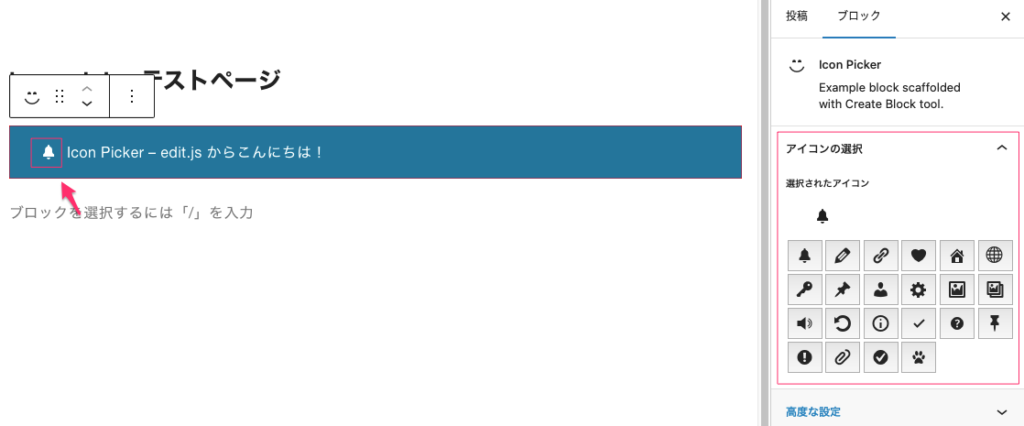
<h3>選択されたアイコン</h3>
<div className="section-icon">
<span className={`dashicons dashicons-${attrValue}`}></span>
</div>
<div className="icons-list">
{
icons && icons.map((icon, index) => {
return (
<div key={index} className="icon-item">
<button className="icon-item-button" onClick={()=> setAttributes({
[attrName] : icon.value
})}>
<span className={`dashicons dashicons-${icon.value}`}></span>
</button>
</div>
)
})
}
</div>
</div>
)
}
export default IconPicker;icon-picker.scss:アイコンピッカーのスタイルを設定
インストールパス:/plugins/icon-picker/src/components/icon-picker/icon-picker.scss
.icons-list {
	display: grid;
	grid-template-columns: repeat(auto-fill, minmax(37px, 1fr));
	width: 250px;
}
button.icon-item-button {
	padding: 7px;
	margin: 1.5px;
}
block.json 14-19行業目を追加
{
	"$schema": "https://schemas.wp.org/trunk/block.json",
	"apiVersion": 3,
	"name": "create-block/icon-picker",
	"version": "0.1.0",
	"title": "Icon Picker",
	"category": "widgets",
	"icon": "smiley",
	"description": "Example block scaffolded with Create Block tool.",
	"example": {},
	"supports": {
		"html": false
	},
	"attributes":{
		"icon": {
			"type": "string",
			"default": "wordpress"
		}
	},
	"textdomain": "icon-picker",
	"editorScript": "file:./index.js",
	"editorStyle": "file:./index.css",
	"style": "file:./style-index.css",
	"viewScript": "file:./view.js"
}
import { __ } from '@wordpress/i18n';
import { InspectorControls, useBlockProps } from '@wordpress/block-editor';
import { PanelBody } from '@wordpress/components';
import { Fragment } from '@wordpress/element';
import IconPicker from '../components/icon-picker/icon-picker';
import './editor.scss';
export default function Edit({ attributes, setAttributes }) {
const { icon } = attributes;
return (
<Fragment>
<InspectorControls>
<PanelBody title={__('アイコンの選択', 'first-block')} initialOpen={false}>
<IconPicker
attrName="icon"
attrValue={icon}
setAttributes={setAttributes}
/>
</PanelBody>
</InspectorControls>
<div {...useBlockProps()}>
<p className="section-icon">
<span className={`dashicons dashicons-${icon}`}></span>
{__('Icon Picker – edit.js からこんにちは!', 'icon-picker')}
</p>
</div>
</Fragment>
);
}
import { useBlockProps } from '@wordpress/block-editor';

export default function save({ attributes }) {
	const { icon } = attributes;
	return (
		<div {...useBlockProps.save()}>
			<p className="section-icon">
				<span className={`dashicons dashicons-${icon}`}></span>
				Icon Picker – save.js からこんにちは!
			</p>

		</div>
	);
}
.wp-block-create-block-icon-picker {
background-color: #21759b;
color: #fff;
padding: 2px;
}
.section-icon {
margin-left: 30px;
display: flex;
align-items: center;
gap: 10px;
line-height: 5px;
}.wp-block-create-block-icon-picker {
border: 1px dotted #f00;
}ここで作成した icon-picker.zip 以下からダウンロードできます。